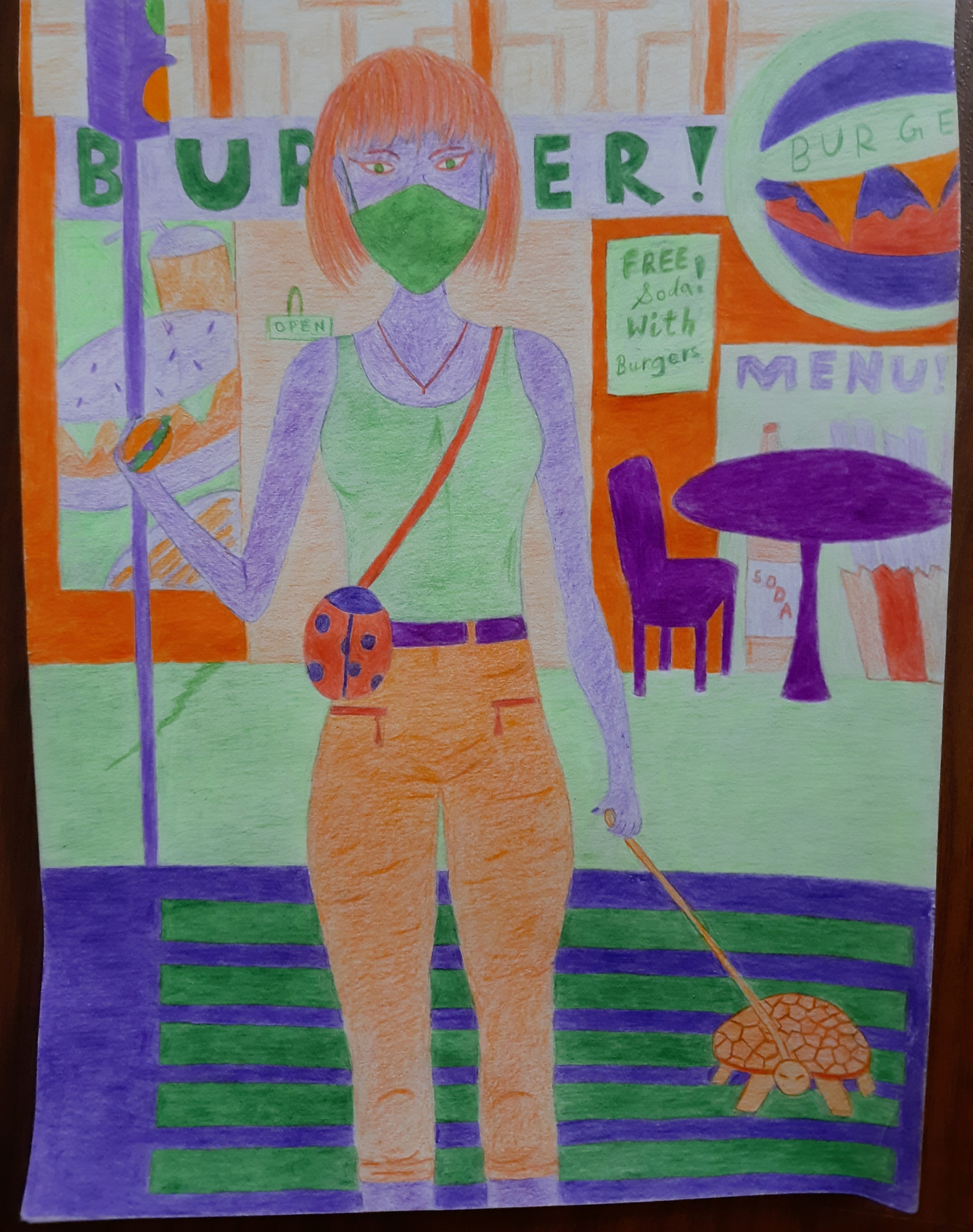
For this assignment, we had to use color pencils to create a drawing using only a specific color scheme. The color scheme could be monochromatic, analogous, complimentary or triadic. A monochromatic color scheme is when a single color is used along with all the different shades of that color. An analogous color scheme is made up of three colors that are next to each other on a color wheel. A complimentary color scheme is made up of two colors that are opposite to each other on the color wheel. A triadic color is made up of three colors that are evenly spaced on the color wheel. I chose the triadic color scheme of purple, green and orange.
Steps
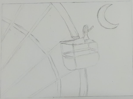
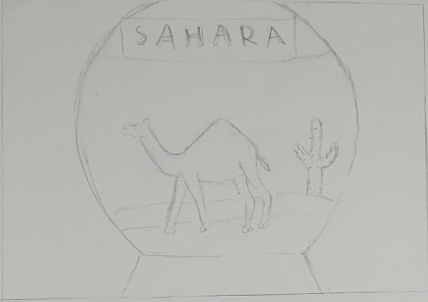
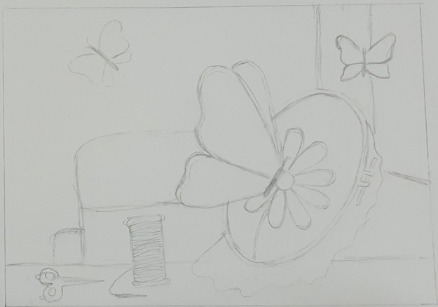
Step 1 : Firstly, I drew 4 sketches of what I would draw and color thst had a circular object. The first one was a girl on a ferris wheel reaching towards the moon, except she was standing on top of the seat compartment. In this the ferris wheel was the circular object. The second one is a snow globe (which is circular), however inside it had a camel in the Sahara desert and so is ironic. The third one has an embroidery hoop - which is circular - with butterflies.
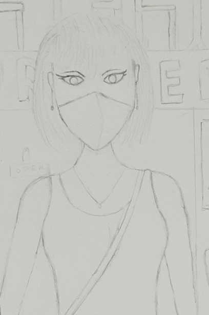
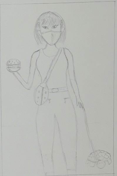
Step 2 : My fourth sketch is the one I ended up choosing. This is because it had numerous circular objects in it such as - the ladybug bag, a belt, a burger, a face, a turtle, a table and traffic lights. I then drew this onto an A4 paper.
Step 3 : Then I colored it with the color pencils. I used the techniques blending and burnishing. Burnishing is when you layer two different similar colors and then layer one more similar at the top with all your force. Soft blending is when you layer three similar colors on top of each other, apllying equal pressure on all three layers.
Reflection
Something that went extremely well was the coloring of every single aspect of the artwork. There is no place where it seems like there is too much of one color and too little of another or where the colors look abnormal. Something I can improve on is that I should use a reference next time when I draw a human. Athough the person looks somewhat realistic, some of the body parts look very disproportionate and I just drew her based on my memorty of human body parts. I faced failure when coloring her pants. For some reason, I kept accidentally drawing darker lines in some areas and made it uneven. I dealt with this my realising that I could exaggerate those lines and make it simply look like the texture of the pants. Although some of the line are still at weird angles for creases on a pant, it mostly solved the problem.
.png)

.jpg)